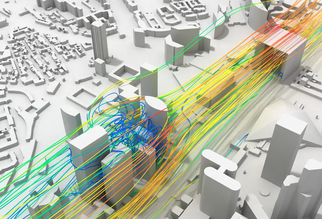

A comfort map comes back with a red patch by the entrance. The fix depends entirely on what put it there: a canopy answers one cause, a corner chamfer answers another. The shape of the patch is what tells you which cause you have.
This page covers the seven named wind effects, how to identify each one from a result, and the wind rose and comfort map fundamentals underneath every assessment.
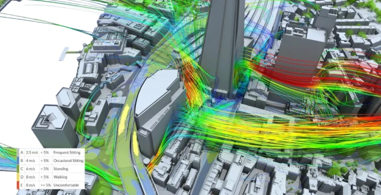
Why street level gets a different wind than the forecast
Mean wind speed rises with height, because surface friction slows the air near the ground. That profile is the atmospheric boundary layer, and it is the precondition for everything below. A tall building intercepts air that is inherently faster than anything at pedestrian level, and every amplification effect is a mechanism for bringing that fast air down to 1.5 m.
Two numbers frame why it matters. NEN 8100 uses a single 5 m/s hourly-mean threshold at pedestrian height, and grades a location by how often it is exceeded. Gusts above 15 m/s are the separate danger criterion. The full criteria sets, Lawson and LDDC included, are covered in Lawson wind comfort criteria.
| NEN 8100 class | Exceeds 5 m/s | Quality | Suitable for |
|---|---|---|---|
| A | under 2.5% | Excellent | Long-term sitting |
| B | 2.5 to 5% | Good | Strolling, short sitting |
| C | 5 to 10% | Moderate | Walking, poor for sitting |
| D | 10 to 20% | Poor | Brief transit only |
| E | 20% or more | Very poor | Uncomfortable for effectively all use |
The seven wind effects
| Effect | Mechanism | Where it shows up |
|---|---|---|
| Downwash | Fast air aloft stagnates on a tall windward facade and a branch is driven down to ground level, forming a recirculation at the base | A discomfort band running parallel and close to the building base |
| Channeling / gap flow | Flow between closely spaced buildings accelerates at street level. Commonly called the Venturi effect, which is a misnomer | Elongated patches in gaps, long straight streets and converging layouts |
| Corner acceleration | Flow cannot turn a sharp vertical edge, so it separates and accelerates around it. A slow-cored corner vortex forms between separation and reattachment | A curved patch hugging the corner, aligned with flow direction |
| Wake and vortex effects | A low-mean-speed, high-turbulence separated region downstream, with vortices shed alternately from the sides | Gustiness rather than high mean speed. Can fail a gust criterion while passing a mean one |
| Pressure short-circuiting | A windward face sits at high pressure and leeward faces at suction. Any aperture between them drives a jet whose speed is set by the facade pressure difference, not the local wind | Undercrofts, archways, porte-cocheres, through-building passages |
| Sheltering / wind shadow | Upwind obstructions reduce downwind speeds. Directional, so a site can be sheltered from one sector and exposed to another | Behind upwind massing. Removable by a neighboring demolition |
| Wind blocking | Buildings divert the approaching flux up and over the massing rather than through it | The mechanism that explains why gap flow underperforms Venturi predictions |
The diagnostic table
The signature of a problem in a comfort plot tells you the mechanism, which tells you the lever.
| What you see on the comfort map | Likely effect | The lever that works |
|---|---|---|
| Band parallel to and close to the tower base | Downwash | Setbacks and stepped massing; canopies and awnings at street level; relocating the tower within the block |
| Curved patch hugging a corner, following flow direction | Corner acceleration | Chamfer or round the corner; corner planting; wind-permeable screens |
| Elongated patch in a gap or along a straight street | Channeling | Split one mass into two; bevel the upper windward corner; stagger or curve the street network |
| High gust category where mean speed passes | Wake and vortex | Porosity; break up the downstream face; reposition relative to the upwind building |
| Violent, very local jet at an opening | Pressure short-circuiting | Close, baffle or offset the aperture; add a lobby |
| Unexpectedly calm, and stagnant in summer | Over-sheltering | Open a ventilation path; check the summer rose separately |
Effects do not arrive one at a time
Real sites show several simultaneously, and they interact. A tower on a podium produces downwash that the podium roof intercepts and speeds up again off the podium edge, which then channels along the street between the podium and its neighbor. Attributing that patch to a single effect is bookkeeping.
The practical consequence is that mitigations have to be tested together. A canopy that fixes downwash at the entrance can worsen the channeled flow beside it.
Three layouts that reliably cause problems
Architects tend to think in configurations rather than effect names, so here are the three that recur.
The corner-facing site. A building oriented so a corner faces the prevailing wind puts corner acceleration on two facades at once, and the sharpest discomfort at the point most likely to be an entrance.
The tower on a podium. The podium roof interrupts the downwash cavity, so the descending flow speeds up again off the podium edge instead of dissipating at ground level. It is the case that gets missed when each effect is considered on its own.
Parallel rows. Long parallel blocks with the wind aligned along the gap produce sustained channeling with no relief along the street length. Staggering or curving the run breaks it.
A useful escalation trigger: risk rises sharply once a building exceeds roughly twice the height of its immediate surroundings.
The Venturi effect is the wrong name, and the correction is useful
This one is worth getting right, because the intuition it replaces leads somewhere expensive.
The received idea is that narrowing a gap squeezes the air and speeds it up, like a Venturi tube. Blocken and colleagues tested it directly. In converging passages between perpendicular buildings, the passage flow rate was lower than the free-field flow rate for every passage width tested. For a 10 m passage between 30 m buildings, only about 10% of the air approaching the passage frontal area actually went through it. Even the widest passages tested, at 90 m, passed under 50%. Diverging passages consistently passed more air than converging ones, which is the reverse of the arrangement a Venturi would favor.
The mechanism is wind blocking: air meeting the facades is deflected up and around the buildings rather than forced through the gap.
The design consequence runs against the intuition. Narrowing a gap does not make the wind worse in a straight line, because the amount of air willing to enter the gap falls as the gap tightens. The two effects work against each other, so pedestrian-level amplification peaks at an intermediate width rather than at the narrowest one, and both a tight slot and a wide plaza can outperform a mid-sized alley.
The practical instruction is to test the width rather than reason about it. If you are tuning a gap, run two or three widths and look at where the amplification actually peaks for your geometry.
Canyon proportions matter too, though for a different mechanism. When wind blows across a street rather than along it, the height-to-width ratio sets the regime: below roughly 0.35 the building wakes do not interact, between 0.35 and 0.65 they begin to, and above 0.65 the flow largely skims across the rooftops and a recirculating cell forms in the canyon. Channeling is the along-axis case, so a street can be in the skimming regime for cross-wind and still channel hard when the wind swings parallel.
We keep the word Venturi on this page because that is what people search for. It remains a misnomer.
Reading the effect deep-dives
Each of the three most common effects has its own article with the full mitigation set, the baseline-versus-improved comparisons and the worked interventions.
- Building downwash: 5 strategies to counteract urban wind discomfort covers setbacks and stepped massing, street-level canopies and barriers, landscaping as windbreaks, and windward versus leeward placement of the tower within a block.
- Mitigating the channeling effect covers chamfering the upper windward corner, tree lines and shrubbery, street furniture as deflectors, and splitting one mass into two.
- Mitigating the cornering effect covers street orientation relative to the prevailing wind, rounded and chamfered corners, corner planting, wind-permeable screens and lattices, and setback depth.
Wind roses, wind maps and comfort maps
Everything above depends on knowing what the wind does at the site, and the vocabulary here gets used loosely enough to cause real confusion.
What a wind rose is
A polar histogram of directional frequency, built from long-run records at a reference weather station.
- Sectors. 16 compass sectors of 22.5 degrees each is the meteorological convention. Wind engineering practice runs anywhere from 4 to 36 directions, with 12 at 30 degrees and 16 at 22.5 degrees the common choices and 36 at 10 degrees the high-resolution case.
- Petal length is frequency, meaning how often the wind blew from that direction. Concentric rings are the frequency scale, zero at the center.
- Color bands are speed bins stacked within each petal, so one petal carries both how often and how hard.
- Calm percentage is reported separately, usually as a center label, because calm hours have no direction and would distort every petal.
Wind is named for where it comes from. A south-west wind blows from the south-west toward the north-east. Getting this backwards is the most common error in site analysis diagrams.
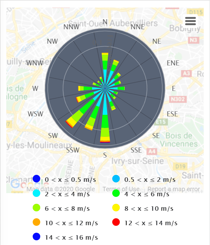
Two things about a rose regularly catch people out. The most frequent direction is not necessarily the most damaging, because a rare but strong sector can dominate the exceedance statistics that decide your comfort category. And roses differ by season, so an annual rose can hide a conflict between summer ventilation and winter exposure. Check the seasonal roses separately before you commit to an orientation.
How directional frequency becomes a result
- Run the flow field for each wind direction, giving a dimensionless amplification factor per point per direction
- Apply the per-direction terrain factor for upstream roughness. This is where sheltering enters
- Weight each direction by its frequency and speed distribution from the rose
- For each point, compute the probability of exceeding each criterion threshold
- Walk the thresholds from most severe downward; the point takes the first category it satisfies
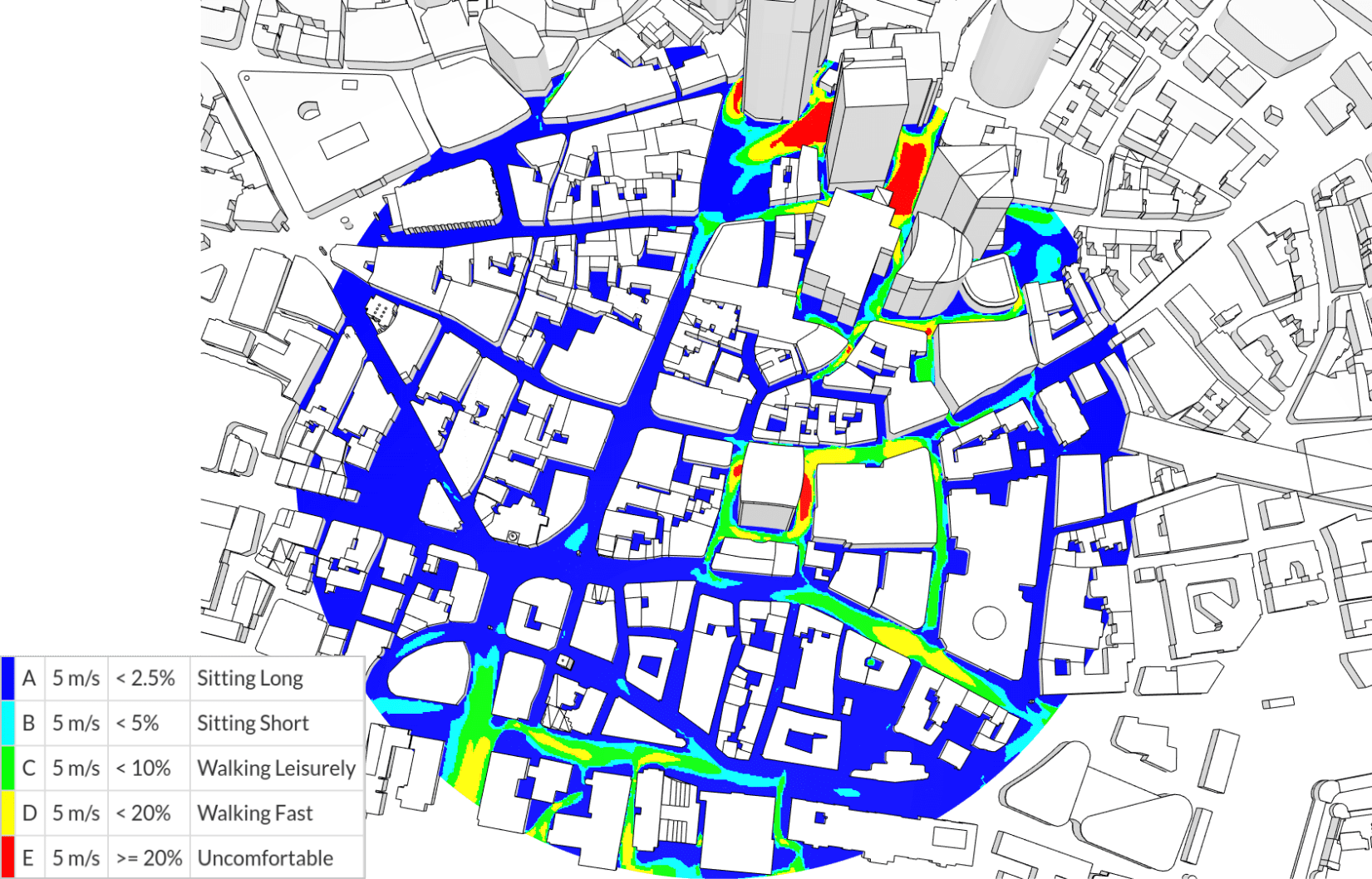
- Color every point by category. That is the comfort map
Four things that get called the same thing
| Artifact | What it shows | Answers |
|---|---|---|
| Wind rose | Directional frequency at one reference point. An input, no geometry | Where does wind come from, and how often? |
| Wind speed map | Spatial speed or amplification field at pedestrian height, usually one direction | Where is it fast? |
| Comfort map | Spatial comfort category, all directions weighted by the rose against a criterion | Where is it unacceptable, and for what activity? |
| Site wind diagram | Site outline, north arrow, rose, prevailing arrows, sheltered and exposed zones | What should the massing do? |
The distinction that catches people out: a wind speed map is per-direction, a comfort map is all directions. A site can look fine on the prevailing-direction speed map and still fail its comfort map, because a less frequent but stronger sector drives the exceedance.
Getting the answer for your own site
Run every direction. Assessing the prevailing direction alone is the most common shortcut in this whole subject, and it produces answers that look authoritative and are wrong.
SimScale runs the full 36-direction set in a single cloud job, so the comparison costs one wall-clock cycle. Explore wind simulation or start a free account.
For the next question along: which type of wind study you need, how CFD compares to wind tunnel measurement, and wind loads on the structure itself.
Find out which effect your site has
Run all 36 wind directions in one cloud job and read the comfort map, not the guesswork.
Frequently asked questions
Seven: downwash, channeling or gap flow, corner acceleration, wake and vortex effects, pressure short-circuiting through passages and undercrofts, sheltering or wind shadow, and the wind blocking effect that diverts flow over the massing entirely.
The everyday name for channeling: wind between closely spaced buildings speeds up at street level, strongest along streets and gaps aligned with the prevailing wind. It is often called the Venturi effect, but that name describes the mechanism incorrectly.
Not in the classic sense. Blocken and colleagues found that in converging passages between perpendicular buildings, passage flow rate was always lower than the free-field rate. For a 10 m passage between 30 m buildings, only about 10% of the approaching air went through. Wind is deflected up and around instead.
Not monotonically. There is a worst-case width. The computed maximum pedestrian-level amplification factor was about 1.47 at a passage width of 8 m; at 2 m the peak dropped to roughly 1.0 and moved to the entrance. Very narrow and very wide gaps both perform better than the worst case.
Wind speed rises with height, so a tall building intercepts faster air than exists at street level. That air stagnates on the windward facade and a branch is driven downward, reaching the ground as a downdraft and forming a recirculation at the base. Risk rises once a building exceeds roughly twice the height of its neighbors.
Flow cannot turn a sharp vertical edge, so it separates and accelerates around it. If the downstream wall is long enough the flow reattaches, trapping a slow-cored corner vortex between separation and reattachment. The separating stream itself is fast, which is why tall-building corners are usually the least comfortable spots on a site.
NEN 8100 works from a single 5 m/s hourly-mean threshold at pedestrian height, and grades a location by how often it is exceeded. Gusts above 15 m/s are assessed separately as a danger criterion. The comfort criteria article has the Lawson and LDDC threshold sets.
A polar chart of how often wind blows from each direction at a reference station, typically 16 sectors of 22.5 degrees. Petal length is frequency, rings are the frequency scale, color bands are speed bins, and calm hours are reported separately. Wind is always named for the direction it comes from.
A wind speed map shows the speed field at pedestrian height, usually for one direction. A comfort map combines every direction, weights each by wind rose frequency, applies a criterion such as Lawson or NEN 8100, and shows comfort categories rather than speeds.
Practice ranges from 4 to 36 sectors, with 12 and 16 common and 36 the high-resolution case. Coarse sector counts can miss a street or gap that happens to align with a strong direction.