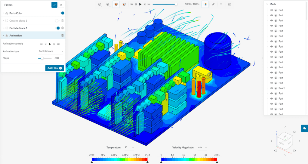
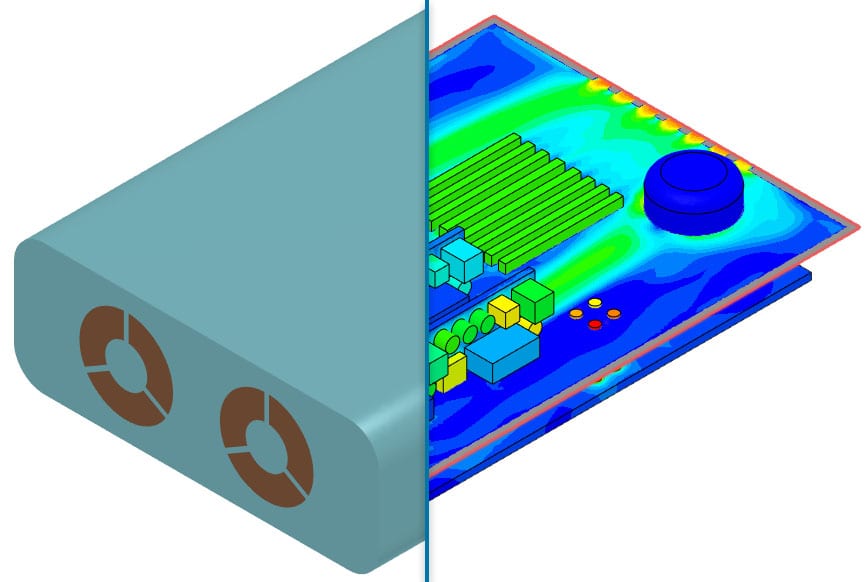
Engineering simulation is all about being able to test and validate your designs, especially in the early development phase. While much of your time is spent preparing your CAD model for simulation and defining the physics of the simulation case, the value of all this time investment is returned during post-processing. Post-processing is where you analyze your simulation result and derive design decisions from it. In this article, we introduce the answer to your prayers; SimScale’s new online post-processor.
While most of our effort over the past quarters has been spent on extending SimScale’s simulation capabilities, platform robustness, and collaboration features, post-processing has now become a major focus of SimScale’s product strategy. Starting with improving the visual post-processing mode, we aim to add a lot more capabilities to SimScale’s post-processor over the coming weeks and months.
A first step is the overhaul of the existing post-processing interface and alignment to SimScale’s layout that you’re used to from the pre-processing environment. A first public version of it has recently been released as an open beta to all SimScale users.

By reinventing the user interface from scratch, we hope to have built the most intuitive and easy-to-use post-processing experience on the web.
Below are a few highlights of what the new post-processing environment has in store for you.
Units
A long requested feature for the post-processor was the ability to change units when investigating your solution fields. You now have the ability to choose among a wide variety of units, both metric and imperial.
To switch the display unit, use either of the drop-down options on the viewer legend bar or in the filter settings.

SimScale’s New Online Post-Processor: Workflow & UI
In case you ever used the old post-processor, you’ll know that finding your way around it wasn’t as easy as it should have been. Applying a result field, showing the displacement of your model under load, or setting up streamlines could be a frustrating experience. Any good software interface should not require you to think in order to accomplish such easy tasks.
The interface of the new post-processor was conceptualized with exactly this goal in mind – to be easy to use. Please let us know if you have any suggestions on how to further improve the intuitiveness of the post-processing experience in SimScale.
Default Visualization State
Many users have requested that we default to a view upon moving into results and this is now working, based on the analysis type you choose.
The new post-processing interface provides a useful default visualization state by default. Depending on your analysis type, the visualization will be initialized with a result field, sensible part visibility, as well as a standard filter configuration.

Solution Field Names
A variety of solvers run behind the scenes in SimScale to calculate the solutions for your simulation cases. Each solver package puts their own labels on the calculated solution fields, leading to a variety of different, and mostly non-descriptive names for one and the same property across solvers. This is causing unnecessary cognitive friction for users. Therefore, in the new post-processor, all solution field names have been translated to be easy to understand (e.g., “k” can now be found as “Turbulent kinetic energy”).
Besides the label translation, related result fields are now grouped together logically. Both vector and tensor components can now be navigated and selected easily.
Topology Update
A common struggle in the old post-processor was the handling of what to show in the 3D result viewer. Unlike SimScale’s pre-processing environment, the post-processor always displayed both surface patches and volume regions separately. It was often hugely time consuming to hide surfaces, this is now available immediately.
The new post-processor now handles the topology of the result data properly. Also, unless accessed via a filter, volume data will be hidden by default, with only surface topology being rendered.
SimScale’s New Online Post-Processor: Loading & Interaction Speed
While the hard-to-navigate user interface of the old post-processor was one issue, another aspect that we aim to improve is the loading and interaction speed of the post-processing interface.
Inherently the post-processor has to deal with large datasets, ranging from a few megabytes for small simulation cases all the way up to many gigabytes for some standard industry-scale simulation projects. Naturally, to make the post-processing experience both fast to load and fluid to interact with is anything but an easy challenge.
While still investing in adding more functionality to the post-processor, our main focus now is directed at finding solutions to those performance aspects, namely making the post-processor faster to load, as well as making the interaction smoother. Stay tuned for what we have in store for you over the coming weeks and months.
To find out more about upcoming features and to leave a comment, please visit SimScale’s feature roadmap. Or feel free to drop me a message directly. We’re here to listen. Let us know what you think!


